- Shaw Support
- :
- Discussions
- :
- Billing & Account Discussions
- :
- 2 Step Verification failure
- Mark Topic as New
- Mark Topic as Read
- Float this Topic for Current User
- Bookmark
- Subscribe
- Mute
- Printer Friendly Page
2 Step Verification failure
- Mark as New
- Bookmark
- Subscribe
- Mute
- Permalink
- Report Inappropriate Content
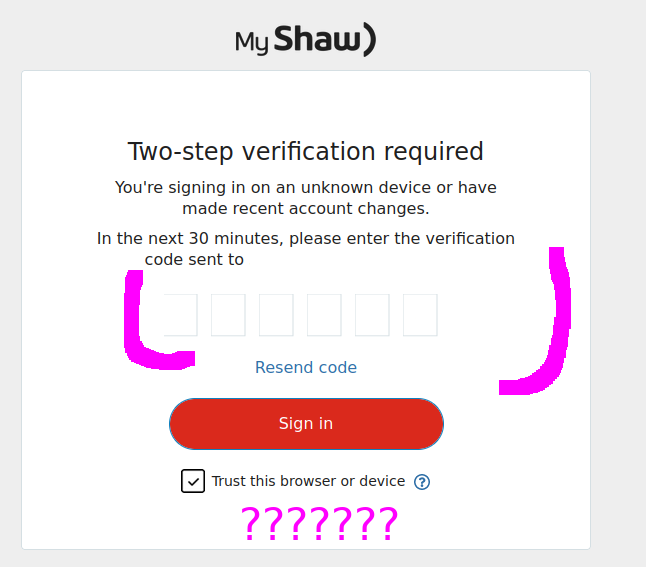
If someone in the community could forward this request to the Rogers web developer responsible for the 2 Step Verification Screen I (as well as others) would appreciate it. The login verification step requires that six digits are entered into a popup dialogue box. The UI designer responsible for this element did an absolutely terrible job of the design. There is no reason to use a perimeter line of #e5ebee on a #ffffff background. This is essentially "white on white". Why would anybody do this? If the popup element does not reveal to the user that there are six "places" (ie empty rectangles) whereby the six digits are to be typed, the element looks like it is still loading or incomplete. As a result the user just sits there waiting for the element to load so that the digits can be entered. This is Apple-grade stupidity. A blank white screen may be appealing to Apple users but the rest of us would prefer to see a UI that is sensible. Please fix this.
Hi , I can see the six boxes fine, never noticed that be...
- Mark as New
- Bookmark
- Subscribe
- Mute
- Permalink
- Report Inappropriate Content
Hi @WantSupprtEmail , I can see the six boxes fine, never noticed that before. However I will agree that it would be more easier to see if they had made the outlining of the boxes a more darker blue, now that you have brought it to my attention. Don't know if this would help or not but maybe send your request through the My Voice link Contact Resolution - Customer Feedback | Rogers Together With Shaw . Well good luck on your mission, sorry I don't know anyone personally that works for Rogers/Shaw.
wrote: a more darker blue Sorry, but "blue" was predomina...
- Mark as New
- Bookmark
- Subscribe
- Mute
- Permalink
- Report Inappropriate Content
@g-idk wrote: a more darker blue
Sorry, but "blue" was predominant only on the pre-Rogers Shaw web-pages.
Now, everything (Roger store-front colours, monthly invoices) features "Rogers red", as the Rogers web-services and accounting teams "touch" every Shaw-written web-page.
🙂 🙂 🙂 🙂 🙂 🙂 🙂 🙂 🙂 🙂
Hi , well sorry, but I can clearly see that the boxes ar...
- Mark as New
- Bookmark
- Subscribe
- Mute
- Permalink
- Report Inappropriate Content
Hi @mdk , well sorry, but I can clearly see that the boxes are indeed a very blue border, and yes almost everything has been turned to red but there are still a few things that are still in the Shaw blue (ie. blue chat button clearly visible on this page) so that is why I said maybe a darker blue would help but if they would go with a red border that would be awesome as well.
-- quite a thoughtful & serious reply to my tongue-in-che...
- Mark as New
- Bookmark
- Subscribe
- Mute
- Permalink
- Report Inappropriate Content
@g-idk -- quite a thoughtful & serious reply to my tongue-in-cheek comment about "red" versus "blue" corporate wars.
For "green" fun, read:
https://canucksarmy.com/news/inside-green-mens-epic-return-rogers-arena-whats-next-canucks
Not as quite as rare as a Ogopogo sighting. 🙂
